
How to program Heartland Restaurant menu.
Understanding the Programming Hierarchy
The programming workflow can be worked from Top down or bottom up. There is a way that each piece fits into another which will be explained below
Menu Group Section↓ Item↓ Modifier↓ Ingredient↓ Context Item↓
Menu Group↑ Section↑ Item↑ Modifier↑ Ingredient↑ Context Item↑
From any of the middle options you can enter the corresponding options for the one above or below. For example, from a modifier you can assign the item it goes to or the ingredients it contains.
We find that it is easier to start at the bottom with the context items and ingredients. However, you can make a Menu Groups and Sections if you like but when you start making items It will become difficult without the lower programming already in place.
Here is a visual breakdown of each piece in the software Before an item is selected:
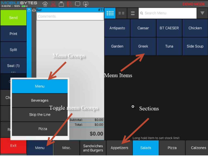
After an item is selected:
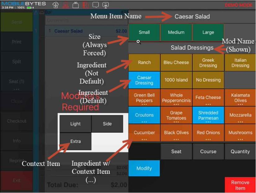
Context Items
Context items show when an ingredient is long pressed and can be used to add more depth to the ingredient. You will know an item has context items attached to it because it will have “…” under the item and when you long press it will show more options. The context item will show under the ingredient on the ticket, so it is useful for things like “on the side” that follow the ingredient. This is not used for things like ADD or SUB as it will confuse the kitchen and the system has its own way of dealing with this.
You can also add a multiplier to a context item to multiply the charge set in the modifier options.
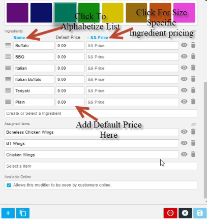
Ingredients
This is a list of all the ingredients you have available to be put into modifiers.
Sub Items
Sub items define which menu items are linked to a selected ingredient. When a user selects the given ingredient, the system automatically inserts the menu item in its place.
When an Item is used as a sub-item, all the item options will be used in place of the ingredient.
This is one of the most powerful and one of the most confusing pieces of the software. If you do not understand this make sure you discuss it with your installer/support technician to gain a better understanding
Context Items
In the content items section, the user can select context items entered in the next section. These context items are used to modify ingredients. Context items can include a price multiplier for the ingredient. For example, a multiplier of of 0 would remove any ingredient pricing where a multiplier of 2 would double the ingredient price.
Modifiers
Menu Modifier Options
*****Each item should a modifier that includes the default ingredients. *****
Name
Modifiers should be named after the ingredients available. For example, a modifier containing ketchup, mustard, and mayonnaise would be named “Condiments.”
Show Name in Header
This setting toggles whether the name of the modifier will appear above the ingredients in the POS.
Minimum Choices
If the minimum choices value is greater than zero, it will be required to add a modifier from this category when ordering one of the assigned items.
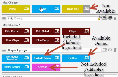
Maximum Choices
This value specifies how many ingredients a guest can add to an assigned item.
A Forced Mod where 1 choice is allowed would have a Minimum of 1 and a Maximum of 1, like a steak temperature.
Number of Included Ingredients
The number of included ingredients value determines how many ingredients from this modifier can be added with no additional cost. Ingredients that are included by default are not included in this number. Button Color
The button color setting changes what color the modifier buttons will appear to the servers.
Ingredients
The ingredients section is where the user creates buttons within the modifier category. First, name the ingredient.
Once an ingredient is named, the default price of the ingredient can be changed. Furthermore, select the dropdown menu of sizes to edit the cost of ingredients in different quantities.
Assigned Items
This is where the user selects which items will have the modifier available.
Menu Items
Menu item options
There are several menu item fields and options that need to be filled in when creating a menu item that will dictate how that item functions in the app, gets reported on, etc.
Image
The image option allows you to choose an image for the item that will show in the app, and online. If you are doing tableside ordering and/or online ordering, it is highly recommended to have images for all menu items as it adds to the experience for patrons.
Name
The name field is required and is the guest facing name of the item that will show on the check.
Short Name
The short name of the item is used for internal facing naming of items. The name given in this field will show on the kitchen printouts, and display on the in the app. In the absence of a short name, the kitchen will see the name of the item.
Description
The item description allows you to add language about the item that will display for the online ordering as well as the large menu item tiles and inside the menu item image pop up in the app. Note that this is a guest facing field, so its best to consider that when writing the descriptions.
SKU/Lookup
The SKU lookup field allows you to add a SKU for the item if you will be scanning the item in a light retail setting.
Price
The price field is where you will put the base price of the item. Note that the item price here will be overridden if you price the item by size. Also note that the price here is reflective before any modifications are made to the item in the POS app.
Tax
The Tax dropdown lets you set the default taxability status of the item. Note that this is just the default taxability of the item. Using the room override for tax inclusive items, you can change how tax inclusive items are taxed.
Taxable
This option will tax the item at the global rate, or the room rate, depending on the location’s needs.
Tax Exempt
This option will not allow the item to be taxed.
Tax Inclusive
This option will tax the item, but the tax will be included in the price of the item. Note that the Daily Summary report will back the taxes out of the item price and display the net price for tax inclusive items, as well as display the tax collected on tax inclusive item sales.
Non-Revenue
This setting option marks this item as non-revenue for reporting purposes. The item sale will not count towards gross or net sales.
Measurement
The measurement drop down allows you to set the item for use with weight scales or manual user input but based upon a measurement. For example, a yogurt shop may charge for yogurt by the ounce. This option lets them add the number of ounces to the item when it is ordered through manual input or automatically using a scale.
Not Measured
Standard default for a menu item.
Per Unit
This option will charge the item by number of units entered. For example, if you charge for chicken wings by the wing, you could have the server enter in the quantity and it will multiply the price times the quantity you entered.
Weighted
These options let you price the item by a weighted measurement and display the amount in the metric selected.
Default Course
This option lets you preconfigure a course for the item when it is ordered. For example, you may make a side salad that you want to pre-course as course 1 so that the server doesn’t need to course the item when it is ordered. Note that the default course can always be changed.
Prevent Discounts
This option will not allow a negative ticket level adjustment, or item level discount to apply to the item. Note that this is an all or nothing setting. There is no way to discount an item with this option turned on at any point.
Hide on Receipt
This option will not show the item on the guest receipt if the item has a price of $0.00.
Gift Card
The gift card option will make the item be a sellable gift card.
Tippable
Whether or not the item’s sales will contribute to service charges and suggested tip amounts. If an item, it not tippable it will not increase the value of service charges on a ticket and it will not factor in to suggested tip calculations. By default, items are Tippable; common items that would typically NOT be Tippable are: gift cards, retail items, merchandise, concert tickets, etc.
Report Category
The report category option lets you assign the item to one of the report categories you have created already like food, alcohol, etc. Note that report categories are 1:1 with a menu item. If you do not assign a category to an item, it will be marked as Uncategorized in the reports.
Kitchen Group
The kitchen group option will let you assign the item to a specific kitchen group that you have already created.
Note that kitchen groups are 1:1 with menu items.
Tags
The field lets you add an unlimited number of tags to the item for use throughout the app.
Attributes
The attributes option lets you assign one or more attributes to the menu item.
Sizes
The sizes field allows you to assign any number of sizes to the menu item. Note that you can price a menu item by size. If utilizing pricing by size, the price field from above will be overridden.
Sections
The sections option allows you to add the menu item to one or more sections so that it can be sold through the app. Note that to sell the menu item in the app, it must be in at least one section. Menu items can belong to more than one section if that is operationally beneficial to the location.
Modifiers
The modifiers drop down lets you select modifier groups for use on the item from the list of modifiers that you have created.
Note that an item can have any number of modifiers relevant for use in configuring the item.
Ingredients that come on an item by default should be selected (highlighted in blue) here.
Sections
Menu Sections allow you to create sections of items that can be assigned to a Menu Group. Menu sections are comprised of groups of specific items relevant to the section. For example, a menu section could be appetizers, entrees, sides, soft drinks, etc. Note that menu sections can be assigned to one or more groups.
Menu Section Options
Name
The name of the section is required for use in the app and should reflect the type of items that are contained in the section.
For example, grouping appetizers in a section is common by labeling that section “Appetizers”.
Menu Groups
The groups drop downs let you add this section into any number of groups you wish.
If you are under the Group Tab, you can go in a group and use drag + drop to organize the sections in the group to your preference. Top to bottom in the group setup corresponds to left to right in the app.
Menu Groups
Menu groups are the highest level of operational menu management, and allow you to create categories based upon day/time of service, type of item sold, etc.
For example, you may wish to create lunch groups, dinner groups, happy hour, etc. Alternatively, you can assign menu groups based upon something like alcohol type (beer, wine, liquor, etc.) or even items unrelated to the food service like restaurant merchandise.
Note that menu groups are only for use in the operation of the POS, and not for Daypart reporting. Dayparts have their own setup options outside of Menu Groups.
You can drag and drop to sort the groups if needed by clicking the 3 horizontal lines icon next to the group name. The group listed first will be the default group visible in the app.
Menu Group Options
Name
The name field is required to create a new menu group.
It is recommended to name the group something relevant to the sections contained in it. For example, you may wish to create a group called Breakfast, and in it put menu sections related to your breakfast item offerings.
Start and End Date
The groups can be assigned to a specific date range if needed.
Use Specific Hours
This option will let you determine which days of the week and which hours in those days the group is available for viewing.
Assigned Sections
The assigned sections drop down lets you choose the sections that are assigned to this group.
You can drag and drop to sort the sections if needed by clicking the 3 horizontal lines icon next to the section name. The sections sorted top to bottom will align right to left in the app.